One of my dreams is to visit and photograph every U.S. National Park. One photographer who has done just this is Quang-Tuan Luong. Recently Fotopedia and Quang-Tuan Luong teamed up to produce the Fotopedia National Parks app for the Apple iPhone and iPad. When I learned this app had been released I was very excited to take a look and provide a review.
In short the application contains 3000 photos of Quang-Tuan Luong and displays them in full screen mode, ideal for an iPad. While Quang-Tuan Luong has photographed each park with a large format camera the photo collection with in the app is a mixture of photos taken with a large format film and 35mm digital camera. If you’re a photographer this might be of interest to you, but know ahead of time technical details of each photo are not included. The focus of this app is to explore the the parks with in the U.S. National Park system.
When you load the application you’ll need to be connected to a wi-fi or 3G network. Due to the number of images featured it is not possible to embed them all in the app without making an enormous download. The solution, as best I can surmise, is to stream content in as you navigate the application.
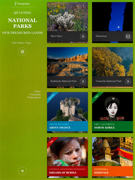
The home screen, the first screen you see of the app, provides (4) four navigation options:
- Linear tour through nearly 1800 images where you manually flip through each image with a finger-swipe.
- Automatic slideshow of nearly 1800 images
- Alphabetical tour of each national park, where all images for a specific national park are presented.
- Trip, more or less a favorites list, is added to the home screen once you begin adding photos to “My Trip”
To be honest I got tripped up by the navigation. As someone who is familiar with the National Park System I was eager to navigate to specific parks. This was not an option on the home screen of the app, but was available as an option once you were on an individual photo page. This method of navigation was not ideal, but manageable. One aspect that was quite nice was the keyword specific navigation available at the photo page level. This too might have benefited from being on the home screen of the app, but I had an easier time making do with this on the photo page. It proved to be convenient to quickly find a specific subject across all the national parks (ex. “Maple” to reveal 4 images of maple trees in Acadia National Park and Cuyahoga Valley National Park)
In short the strengths and weaknesses of this app are as follows:
Strengths:
- Incredibly complete collection of 3000 images covering all 58 national parks
- Amazing photographs by Quang-Tuan Luong
- Smooth pre-loading of images as you navigate, creating a seamless experience as images are accessed online.
- Supported on iPad and iPhone (highly recommended on the iPad)
- Can save photos as wallpaper for your device
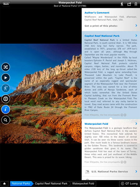
- “Info” links on each photo page includes authors comments, park history/information, image details, links to the U.S. National Park Service web site for each park and a link to Fotopedia
Weaknesses:
- Somewhat confusing home screen navigation
- No means of navigating by national park on the home screen
- Navigation via alphabetical tour of each national park is cached without a means of clearing the cache. This means once you view photos from Acadia you can’t navigate back to Acadia National Park. To do so you have to renavigate the app through another mechanism.
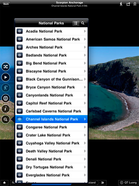
- Navigation by National Park can only be accessed via the search button on a photo page. A missed opportunity to place this on the home screen of the app for easier park based navigation
- Requires a wi-fi or 3G connection with no ability to use the app offline
- “Your Trip” is more or less a favorite function versus a trip planning tool
Screenshots
 Click to Enlarge Home Screen |
 Click to Enlarge Photo/Park Info |
 Click to Enlarge Nav by National Park |
Concluding Thoughts
| Rating: |  |
QT Luong is a phenomenal photographer and Fotopedia National Parks is a great way to view his incredible body of work. The visual design is elegant and the in depth information found with each image is a great way to learn more about National Parks and the attractions with in them. While I found the navigation of the application mildly confusing at times, the sole reason the app gets 4/5 stars, I was able to figure it out and find my way through the app. My hope is that in future releases they continue to optimize the user experience making the navigation a little more intuitive and allowing for offline viewing. All constructive criticism aside I think the app is a steal for $2.99. The ability to access photographs and information about every National Park in a single resource is worth far more than the sale price of the app.
[tags]ipad, iphone, app, review, photography[/tags]

Accounting
Outsourcing Services
http://accountingoutsourcingservices.com/
Our accounting and bookkeeping service
not only reduces your cost but also enables you to get error free completed
work on time for delivery to your clients.
Thanks Jim for your kind words about my images and for an insightful review of the interface.
I like your suggestion of adding the search button to the home screen. Personally, I view that screen as just a “splash page”, the kind that you have on websites with “click to enter”. I just go straight to the first option.
If you want to navigate to Acadia, from any image, you click on the search button (which is really a list/search button) then from that menu there are two ways. You go to the screen titled “National Parks” (with the list option), then click on the eye next to Acadia. Or you begin to type “acadia” (with the search option), “Acadia National Park” appears, and you click it. I am not sure why those methods would be affected by cache. Actually, I am not sure what the problem with the cache is in the first place.
This will probably reinforce your point about the navigation being mildly confusing, but there are actually 3,000 images in the App. However, you cannot see all of them with the top level (1,800 images) or even by browsing by park. To do so, you need to browse by locations within parks, either by list/search, or by the tags at the bottom of the image.
Thanks for the clarification QT. I though there were 3000, but I kept seeing a listing of nearly 1800. I’ll correct the review to reflect that. Thanks for the preview of the app and congrats on its release.