An often unspoken component of photography is image selection. How and why are certain photos chosen over others when reviewing results of a photo shoot? I’ve received questions on this in the past and D. Travis North (Self-Editing to Concentrate Your Workflow – Part 1) has asked me to share my insight to this topic with Kevin Oki (Editing and Workflow – Part 2) as part of a multiple-blogger series.
There are three primary areas of evaluation that factor into my image selection process: Creative Execution, Sharpness and Comparison & Selection. Below are examples and detailed thought surrounding each:
Creative Execution
The first thing I factor into my photo evaluation is to find photos that I’ve taken that match what I envisioned at the time of capture. At this stage of review I strive to be my harshest critic as no one other than myself will know what inspired me or drove me to capture the photos taken. There are (5) areas of consideration that I take into account when reviewing the creative execution of my photos:
- Subject & Vision
- General subject evaluation & uniqueness
- Style (art, documentary or other)
- Identify use type & end destination (fine art, stock, product, final size requirements, etc.)
- Lighting
- Standard, silhouette, or another special exposure
- Flash vs. no flash version
- Special lighting circumstances
- Evaluate if this is a Photoshop project or not
- Evaluate and note future projects if my initial attempt failed
- Composition
- Horizontal or Vertical
- Standard vs. Creative
- Perspective / Angle of View
- Depth of Field
- Shallow, deep or somewhere in between
- Location of focus (Ex. eyes being sharp not the tip of a nose)
- Distracting Elements
- Inadvertent inclusion of subject (contrails, vehicles, etc.)
- Distortion
- Lens flare
- Reflections
Sharpness
Evaluating sharpness is simply a pass or fail step. If an image is not sharp when it is supposed to be then it gets thrown out of contention immediately. Questions I ask regarding sharpness include:
- Is the photo sharp where it is supposed to be?
- Is the degree of sharpness satisfactory?
- Is a lack of sharpness part of the photo style?
The goal is to move through this step as fast as possible, but review of sharpness requires a 1:1 enlargement of each photo. For large files this can be CPU and drive intensive taxing your computer system. To reduce the time this step takes I rely on my earlier creative execution evaluation to reduce the number of photographs to review.
Comparisons & Selection
Final selections are made from the pool of images that are left after reviewing sharpness and creative execution. This step is also the stage where I may provide additional scrutiny if I have sister images (photos that are nearly identical) or in camera duplicates. My decisions at this stage are made based on the following criteria:
- evaluate personal preference
- evaluate use types & target audience (ie putting myself in the shoes of my target viewer/buyer)
- as necessary revisit review criteria for Creative Execution & Sharpness
Examples That Did & Did Not Make The Cut from Costa Rica
Didn’t Make the Cut:
 |
 |
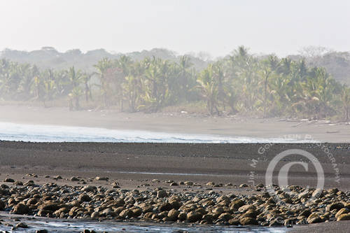
The horizontal version has sea mist concealing the trees a little more than I’d like and the frame is a tad too low introducing mildly distracting highlights from reflected water. I was aiming to keep the rocks on the bottom edge of the frame.
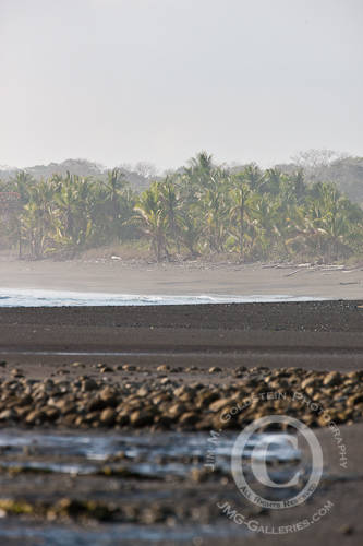
The vertical version is a close second. I’m still not too fond of the water in the lower left quarter of the image, but I do like the alternate perspective of the landscape in this format. I’ll likely use it, but its not what I consider the very best of the set.
Made The Cut:
Using a longer focal length I wanted to compress the distant scene of the beach in Corcovado National Park, Costa Rica creating a variety of layers. Each layer representing something visually interesting and leading my viewer to the tropical and isolated characteristics of the scene. The trees in combination with the distant water was unique and something I wanted to isolate for image viewers to focus on.
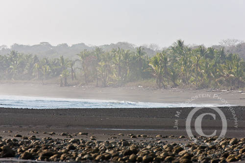
Rainforest Lined Beach -Corcovado National Park, Costa Rica
Didn’t Make the Cut:
 |
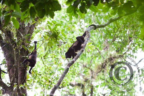 |
the photo on the left would pass my criteria as its sharp, but the monkey wasn’t looking in a direction that allowed me to capture his facial features or his howling behavior. While the photo may have relevance to me, bridging the photo with my personal experience of witnessing the monkeys behavior, others who do not have the benefit of having been there won’t be able to make the same connection. The result will be a photo that is lacking.
On the right the monkey the male howler is moving in to interact with a female. Unfortunately the conditions were quite difficult to expose properly. The detail in the shadows isn’t quite what I’d like and the blown highlights of canopy & sky make this an image that is tougher on the eyes than I’d prefer. This photo would see daylight, but its a low probability this would be shown as a highlight from my trip or as a portfolio piece.
Made the Cut:
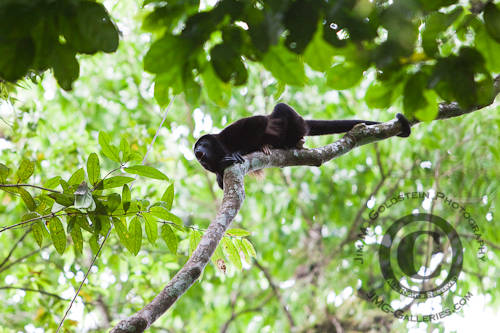
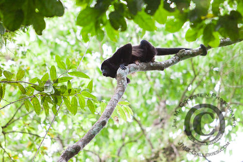
Male Howler Monkey (Alouatta palliata) Howling to Defend His Territory
In this photo the face of the Howler monkey is tack sharp. The posture of the monkeys body is exemplary of how it braces itself to howl and defend its territory. Many elements of the monkeys behavior are captured clearly in this photo including the distinct facial expression while howling. I’m quite fond of the framing of the monkey with elements of the scene including the canopy and the branch he’s on.
Didn’t Make the Cut:
 |
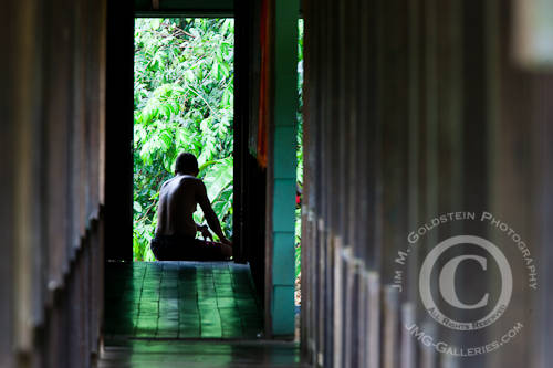 |
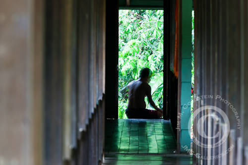
Midday heat and heavy rain are characteristic of the Costa Rican rainforest. Rather than let water ruin my day I started documenting what others did to pass the time. A local guide sitting on a walkway looking out at the jungle exemplified this situation perfectly. Not wanting to take a straight photo I wanted to create an artistic representation of the scene using the lush green and ambient light. This approach required a few attempts. Not making the cut on the left is an image where my subject moved during the longer exposure. This wasn’t what I was aiming for and created distracting ghosting. On the right the photo was sharp, but the sharpness detracted from the image. Everything in the scene is too straightforward and not enough mystery exists in the scene. In addition the posture of my subject wasn’t ideal, as his form becomes lost in itself.
Made the Cut:
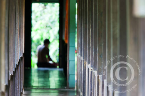
A Guide Waits Out The Rain at Sirena Biological Station in Corcovado National Park, Costa Rica
A shallower depth of field in the foreground worked best. The diffuse glow of the out of focus areas of the image add the sense of mystery that I was aiming for and provide an area of interest that challenges my viewers just enough. The lines created by the perspective of the walkway and columns creates a clean line for eyes to reach my subject that is enhanced by bright light around him.
Didn’t Make the Cut:
 |
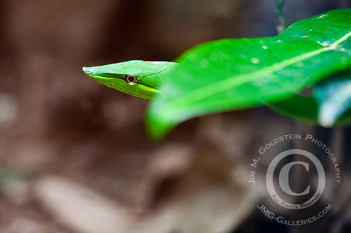 |
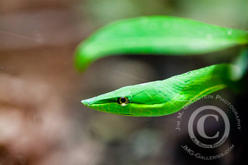
The goal of these photos was to highlight the distinct leaf like shape and color of the Vine snakes head. On the left is an image that had an interesting composition, the snake’s head being parallel to a similarly shaped leaf, resulted in a sub-par photo due to a lack of sharp focus. On the right is an image, juxtaposing the snake with a similarly shaped leaf, that is usable but not the cream of the crop of available photos.
Made the Cut:
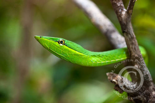
Extreme sharpness, great lighting and vibrant color is what makes this photo the standout from my other photos of the Vine snake. The eye of the snake is razor sharp and the shallow depth of field keeps attention on the unique characteristics of the snake’s head.
Didn’t Make the Cut:
 |
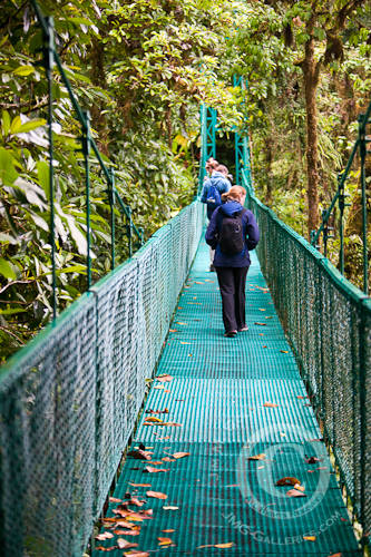 |
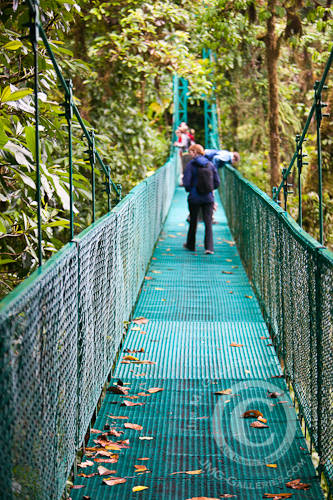
Lighting, focus points, depth of field and busy backgrounds are what kept these two photos from making the cut. On the left the area of focus is too close and there is a clustering of people muddling focus on my subject, the woman in the blue coat with red hair. The photo on the right suffers from the same albeit a little less severely.
Made the Cut:
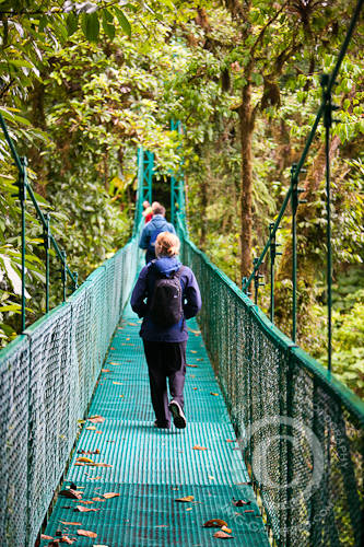
A Tourist Walking the Selvatura Park Canopy Tour & Walkway Bridges
This photo has mild highlights on my subject (particularly her hair) keeping the eye glued to her and differentiating her form from those immediately behind her. In sharp focus and placed properly in the plane of focus given my chosen depth of field this works well. I also like that she’s looking into the rainforest canopy which is what makes this setting so unique. The subtle element that I also like is that her foot is raised as she is walking. This give the added quality of movement that I was looking to capture.
[tags]photography, workflow, photo editing, editing, photo, nature, landscape, stock photo, Costa Rica Selvatura Park, wildlife[/tags]

Pingback: Editing & Workflow Part 3 - 3 Critical Criteria of Any Image Selection Workflow | Shutter Photo
Pingback: Editing & Workflow - Self-Editing to Concentrate Your Workflow | Shutter Photo
Dear Jim, my antivirus software Avira AntiVir Personal found that this page is infected by HTML/Crypted.Gen script-virus. Take a care. I hope it will help.
Thanks for the heads up Snow. I just checked my site and I think your software program may be giving a false positive. I just cleaned up the code on my site a few days ago and there is nothing in my code that would reflect such a virus. Email me if you have any additional info or concern.
Please consider doing more of these. It is interesting and learning experience to see the thought process that you take to get to the final image.
Pingback: 3 Critical Criteria Of Any Image Selection Workflow « Helderberg Photographic Society
Worthwhile read.
If a shoot has produced a lot of images I typically stack, sort for tech. qualities, (and compare) then do my selects (and compare), so I know all my selects are worthwhile. I’ve always wondered if the reverse was worthwhile but never tried to change , just from force of habit.
Putting the creative selection first seems like it would reinforce better creative choices than my current workflow.
Thx for posting!