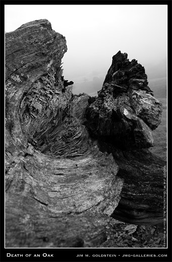
Another photo from my Monday photo outing. On the scale of good to bad of the photos I’ve highlighted so far (The Good, The Bad) this is the worst and as such is “the Ugly”. Photographed is a close up of a fallen Oak with fog shrouded living Oaks on a hillside in the distance.

What warrants giving this photo the “Ugly” destination? Well in concept I liked the idea of creating a juxtaposition of a dead Oak with a living Oak. The problem is the only thing I did right was line up the trees. In my book my focus point was too far into the frame resulting in the foreground being soft. I used a short focal length that made the subject farthest away look small. Using a longer focal length to compress the scene would have worked best. The fog was of benefit and detriment to this photo. The fog helped provide diffuse light so my subject was evenly lit allowing for greater detail in my foreground subject. On the other hand the fog in combination with the short focal length made it particularly difficult to see my background subject, the living Oak.
All in all even “the Ugly” photo helped me understand how to best tackle a shot like this in the future even if I won’t be making a print of this or adding it to my online portfolio.
[tags][/tags]
