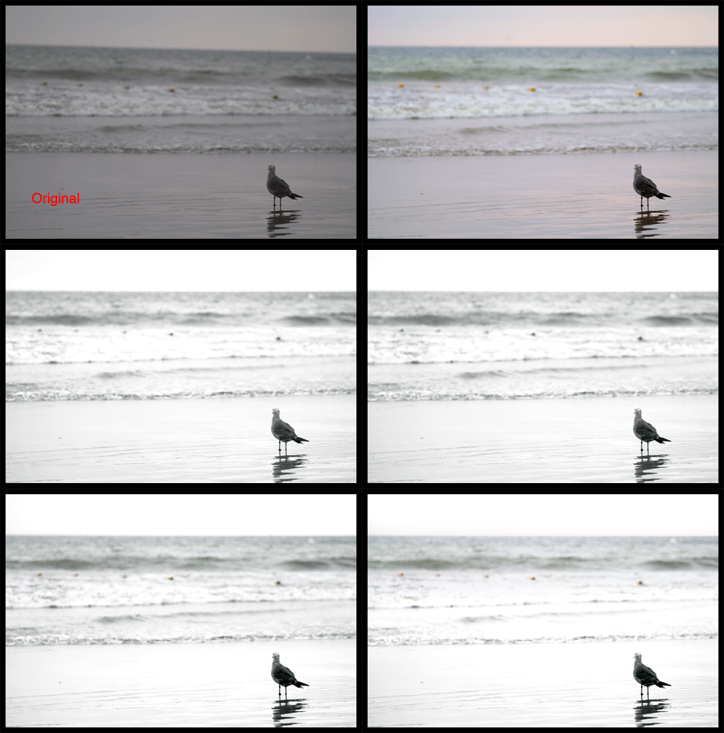
Brian Auer has challenged some of his blog readers to edit one of his photos and the blog project was aptly titled “Edit My Photo“. I thought this was interesting enough that I’d throw my hat in the ring with my very own post-processing interpretation of his image. Below is an animated GIF of his image and my adjustments.
Note: If you want to see the animated GIF repeat refresh the page to get it going again.
![]()

Photo by Brian Auer
A summary of steps follows…
Steps Taken:
1. Opened the RAW file in Photoshop CS2
RAW settings: Exposure +0.80, Shadow 9, Brightness 50 and Contrast 25
2. Made curves, contrast and saturation settings
3. Channel Mix adjustment layer to convert image to B&W
4. Created a Curves mask excluding the bird to create a high-key background to help the seagull stand out more.
5. Created a Contrast mask, just for the bird, to again give the bird greater definition compared to the high-key background.
6. Added a new layer of 18% gray, Layer Blending Options > Blend Mode: Overlay and set layer opacity to 15%. Then burn areas in need of greater contrast.
7. Created a layer mask for contrast to the foreground only
8. Duplicate the color corrected image and added it to the top of layer stack. Set Opacity to 40% and erased all of this layer, except for water below the horizon and above the whitewater.
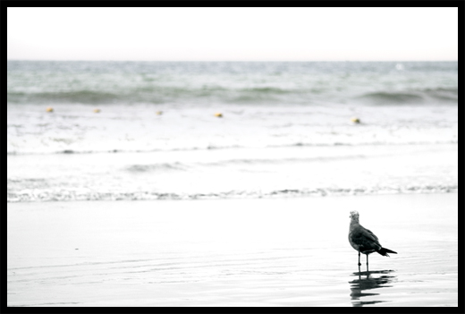
9. Created a Curves mask adjusting everything but the foreground to further enhance the high-key nature of the photo.

Photo by Brian Auer
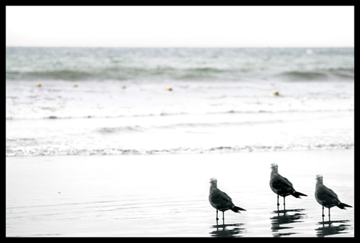
10. My for fun step was to duplicate the birds into a group of three.

Photo by Brian Auer
Considerations:
1. Because of the mostly uniform gray tone to the image I felt it was important to give the seagull, the subject of the photo, greater definition to pop against the background. Much of this was done with curves and contrast adjustments to create the high-key style.
2. Having the image as 100% black and white diffused the compositional element of the diagonal line created by the yellow buoys. To counter act that I decided to keep a mild hint of color to the image. This allowed for the preservation of a subtle compositional component.
3. Preserving negative space was very important so no crops were made to the image. I experimented with cropping down below the horizon, but I decided against it because the bird, looking out, spurs the viewers eye to do the same. Looking out to the horizon is far more interesting than looking out to a mass of blown out grayish water.
[tags]epicedits, Brian Auer, post-processing, photo, photography[/tags]

Dude, you rock! That animated thing is pretty awesome too — it caught me off guard. Great processing, and great job of “telling” the viewer where to look by overexposing the foreground and leaving the negative space. The slight inclusion of color is probably my favorite part of this — you don’t notice it at first, but then you see the buoys. This then leads you to wonder if that really might be a hint of blue in the upper section of water.
All in all, a great (and unique) addition to the project. I’ve put a link up in the temporary results page with the others.
Brian… glad you enjoyed the presentation and the reasoning behind the choices made on my post-processing. I look forward to seeing more entries.
One of the better presented entries to this I have seen…
Thanks Paul
Pingback: Phill Price » Blog Archive » Photo Editing
Pingback: 28 Ways To Interpret A Photo | Epic Edits Weblog
Pingback: 28 ways to process/improve/hack/play a photo
Great work Brian, seems realistic not like the edited photo even i got an interest to work on photoshop for editing some pictures thanks for your article….