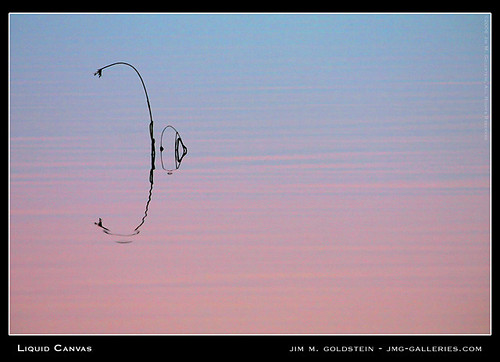
One of the most difficult tasks as a photographer is to master the art of less is more. One of the most common techniques employed to accomplish this is to utilize “negative space”. “Negative space” is empty space left around and between your subject.
When employed correctly, the empty space around your subject provides a subtle backdrop to place emphasis on your subject. Combined with a carefully crafted composition the visual impact can be quite beautiful.
See the following two examples exemplifying the use of “Negative Space”

In the case of “Liquid Canvas” a silhouette is employed to place greater emphasis on the bending reed in the water.

In the case of “Between Storms” the subtle pattern and colors of the sky provide the negative space around the Golden Gate Bridge.

Love the wide angle in the second photograph. Thanks Jim!
Great explanation. If you don’t mind, I’d like to expand on this:
Negative Space cannot only be used to emphasize the main object (Positive Space), but can also can add layers of complexity through forcing the viewer to re-evaluate his notion of what in the image is in fact Positive and what is the Negative Space.
A great master of this is Andre Kertesz. Here is a simple example: http://tinyurl.com/2gtg76 . Depending on what you consider to be the subject of the image (the clock or the street behind it) the notion of Negative Space switches. If you look at the street, the clock is the Negative Space, if you look at the clock the street is the negative space. With more layers, this can become increasingly complex.
A few complex examples, also Kertesz:
– http://tinyurl.com/2xlbax
– http://tinyurl.com/2ebjuw
And my own attempt:
– http://tinyurl.com/2goxmc
Sorry, the second complex example is indeed by Lee Friedlander, not Kertesz.